The final lecture of the cycle International Branding was held on March 21. Olesya Tomyuk talked about how modern business builds the profile of an ideal client and how it is actually not easy to come up with an effective logo and visual image of the company.
Luxury brands are not made in factories, they must be handmade. Part of the product, parts of clothes or bags, of course, are made automatically, but a significant part of its creation is manual labour, which is why this product is so expensive.
– In luxury, no one tries to create a product for the user, noted the lecturer.
Luxury sets the trend, teaches you to love it. It should be the customer wanting to get their item, not the company looking for the buyer.
So how to categorize the customers? The first thing that comes to mind – by gender. However, according to Olesya Tomyuk, this will be a very rough classification. Do women like the same colours and material? Do they behave the same way and have the same problems? No. Not to mention the fact that such a classification has recently been generally avoided in the leading countries. People can identify themselves in a different way, which is why, for example, in European countries they refuse to have separate toilets – they no longer see the need for them, besides, this practice offends a part of society with a different identification. Most businesses no longer use such a division.
It is being replaced by a new approach that is more accurate, more humane and more effective. Buyer persona – profile of the ideal client. This is literally a fictional character, with his own tastes, character and problems. This is the person for whom the brand creates a product.
The main elements of brand design are:
- logo;
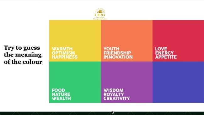
- colour;
- typography;
- images.
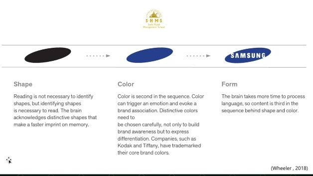
If you understand how human perception works, you know that the brain works according to a certain algorithm. Firstly it analyzes the shape, then the colour and finally the details. Your logo must be recognizable at all stages. Creating a logo is an artistic process. Behind the simple, at first glance, drawing there is a painstaking creative process and analysis.
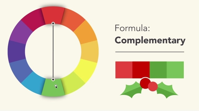
To choose a colour, a special spectrum is used. It can be a monochrome logo (Starbucks, Samsung), or a two-colours logo for which adjacent or opposite colours on the spectrum are used. If your logo has three or even four colours, then a triangle and a quadrilateral are drawn in the round spectrum, respectively. So the colours will have a harmonious look on the logo.
And finally there is a font, which is quite often underestimated. But large companies understand its power and even create their own unique typeface. In general, there is one big classification here. There are two types of fonts. In serif, letters have serifs. This style of text reflects antiquity and traditions; old newspapers, historical documents and books were printed in this font. It can be seen in Zara, Rolex or Prada brands. Another type is sans serif (fr. sans – «without»), i.e. letters do not include serifs. It reflects progress, modernism and the digital era. It is used in the logos of Google, Supreme and Spotify. Also it is used on the website of Lviv Polytechnic.
This was the final lecture of the International Branding cycle. Students learned a lot for themselves. Olesya Tomyuk presented information clearly and simply, and encouraged interactivity. Meetings with the guest lecturers are a great opportunity to gain valuable knowledge from masters of their field.
– Believe in yourself, because you are all smart, you are all ambitious people! Be successful at selling yourself! – advised Olesya Tomyuk at the end of the lecture.


